Why are traffic areas becoming increasingly colorful?

Sven Meier
Driving instructor and president
of Verkehrsschule Zug
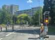
We enjoyed Carnival to the fullest. Confetti is slowly disappearing from the ground, but something else is becoming increasingly noticeable: our roads are becoming more and more colorful. Red and green areas, blue waves, yellow dots. Many people are asking themselves: what is the meaning behind these color designs? Do they have a significance or are they just for visual appeal? It’s time to shed some light and color on the matter.
What is behind the colored areas?
Since 2008, Switzerland has had a standard for the color design of road surfaces, known as FGSO for short. Before that, cantons and municipalities designed their roads in very different ways. One thing is important to note: FGSO markings are not official signals or markings under road traffic law. They have no legal significance!
Important to know
FGSO markings must not resemble official markings such as pedestrian crossings and must not be confused with traffic rules. They do not grant right of way and do not replace traffic signals. Their character is therefore purely decorative.
Their purpose is clearly defined: to design the road space, visually demarcate areas such as 30 km/h zones, improve awareness, and reduce speed. Color is therefore intended to support, not regulate.
Does color make a road safer?
Color can make an indirect contribution to safety. Nevertheless, color remains a design measure. It does not create direct safety.
Those who apply the standard correctly can maintain the existing level of safety. A deterioration in safety is not permissible. Color must not cause confusion or create false expectations, even if creative designs sometimes tempt us to do so.
When can color be used?
The standard mentioned above allows exactly three types of color design for road surfaces:
Large-area coloring. A maximum of two colors across the entire roadway. The area must be at least three times as long as the road is wide from sidewalk to sidewalk. This makes it clear that it is not a pedestrian crossing.
The multi-purpose lane in the middle of the roadway. Here, too, a maximum of two colors are permitted.
Wide strips at the edge of the roadway. These may be designed with a maximum of one color.
These specifications are deliberately clearly defined. A design must never be interpreted as a traffic rule.
Is the use of color appropriate?
Despite all the limitations, I believe the use of color is appropriate. It makes perfect sense for optimizing and enhancing the road space. In the best-case scenario, road users will drive more attentively, look more closely, reduce their speed, and be more aware of their surroundings. Even if there is no obligation to use color, it can have a positive effect for the reasons mentioned above.
And perhaps the same applies here as so often in road traffic: if we look a little longer and drive a little slower, everyone benefits in the end. So more color can’t hurt, as long as it remains clear and doesn’t regulate traffic, but rather accompanies it.

Blickensdorferstrasse Steinhausen

Ratenstrasse Alosen

St. Wolfgang-Strasse Hünenberg